Author: John Hunter

  • LendingClub Filters, Selecting Loans and Automated Investing

    This post continues our series on peer-to-peer lending (and LendingClub): Peer to Peer Portfolio Returns and The Decline in Returns as Loans Age, Investing in Peer to Peer Loans. LendingClub, and other peer-to-peer lenders let you use filters to find loans that meet your criteria. So if you chose to take more, or less, risk you can use filters to find loans fitting your preferences. Those filters can also be applied to automate your lending.

    There are resources online to help you understand the past results of various investing strategies (returns based on various filters). Some filter are just a trade-off of risk for return. You can invest in grade A (a LendingClub defined category) loans that have the lowest risk, and the lowest interest rates and historical returns. Or you can increase your risk and get loans with higher interest rates and also higher historical returns (after factoring in defaults).

    historical chart of returns by grade at Lending club
    Description of chart: This chart shows the historical performance by grade for all issued loans.

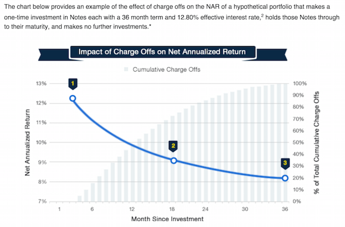
    This chart includes all loans that were issued 18 months or more before the last day of the most recently completed quarter. The historical returns data in the chart is updated monthly.

    Adjusted Net Annualized Return (“Adjusted NAR”) is a cumulative, annualized measure of the return on all of the money invested in loans over the life of those loans, with an adjustment for estimated future losses.

    LendingClub lets you set filters to use to automatically invest in new loans as funds are available to invest (either you adding in new money or receiving payments on existing loans). This is a nice feature, there are items you can’t filter on however, such as job title. And also you can’t make trade-offs, say given x, y and z strong points and a nice interest rate in this loan I will accept a bit lower value on another factor.

    So I find I have to be a bit less forgiving on the filter criteria and then manually make some judgements on other loans. For me I add a bit higher risk on my manual selections. I would imagine most people don’t bother with this, just using filters to do all the investing for them. And I think that is fine.

    Practically what I do so that I can make some selections manually is to set the criteria to only be 98% invested. This will cause it to automatically invest any amount over 2% that is not invested. You can set this to whatever level you want and also is how you can make payments to yourself. I will say I think one of the lamest “features” of LendingClub is that is has no ability to send you regular monthly checks. So you have to manually deal with it.

    It should be simple for them to let you set a value like send me $200 on the 15th of each month. And then it manages the re-investments knowing that and your outstanding loans. But they still don’t offer that feature.

    As I said one of the factors in setting filters is managing risk v. reward but the other is really about weaknesses in the algorithm setting rates. You can just see it as risk-reward trade-off but I think it is more sensible to see 2 different things. The algorithm weaknesses are factors that will fluctuate over time as the algorithm and underwriting standards are improved. For example, loans in California had worse returns (according to every site I found accessing past results). There is no reason for this to be true. If a person with the exactly same profile is riskier in California that should be reflected in higher rates and thus bring the return into balance. My guess is this type of factor will be eliminated over time. But if not, or until it is, fixed filtering out loans to California makes sense.

    Once you set your filter criteria then you select what balance you want between A, B, C, D, E and FG loans. I set mine to

    A 2%
    B 16%
    C 50%
    D 20%
    E 10%

    I actually have a bit over 1% in FG (but I select those myself). In 2015 the makeup of the loans given by LendingClub was A 17%, B 26%, C 28%, D 15%, E 10%, F and G 4%.

    Related: Where to Invest for Yield Today (2010)Default Rates on Loans by Credit ScoreInvesting in Stocks That Have Raised Dividends ConsistentlyInvestment Risk Matters Most as Part of a Portfolio, Rather than in Isolation

    Sadly Lending Club uses fragile coding practices that result in sections of the site not working sometimes. Using existing filters often fails for me – the code just does nothing (it doesn’t even bother to provide feedback to the user on what it is failing to do). Using fragile coding practices sadly is common for web sites with large budgets. Instead of using reliable code they seems to get infatuated with cute design ideas and don’t bother much making the code reliable. You can code the cute design ideas reliably but often they obviously are not concerned with the robustness of the code.

  • The 20 Most Valuable Companies in the World – February 2016

    The 20 publicly traded companies with the largest market capitalizations. Since my October 2015 list of the 20 most valuable stocks many of the market caps have declined significantly.

    Company Country Market Capitalization
    1 Apple USA $541 billion
    2 Alphabet (GOOGL) USA $496 billion
    3 Microsoft USA $412 billion
    4 Exxon Mobil USA $341 billion
    5 Berkshire Hathaway USA $329 billion
    6 Facebook USA $311 billion
    7 GE USA $300 billion
    8 Johnson & Johnson USA $296 billion
    9 Amazon USA $262 billion
    10 Wells Fargo USA $245 billion

    Apple lost $131 billion in market cap since my October post. Alphabet (Google) lost just $1 billion in market cap, and for a short time moved past Apple into the top stop. Facebook achieved a rare increase during this period, gaining $16 billion and moving up 1 spot on the list. All the top 10 most valuable companies are based in the USA once again.

    The next ten most valuable companies:

    Company Country Market Capitalization
    11 Nestle Switzerland $226 billion
    12 Roche Switzerland $226 billion
    13 China Mobile China $219 billion
    14 Walmart USA $216 billion
    15 JPMorgan Chase USA $214 billion
    16 Procter & Gamble USA $211 billion
    17 Verizon USA $209 billion
    18 Industrial & Commercial Bank of China China $206 billion*
    19 Novartis Switzerland $195 billion
    20 Petro China China $191 billion

    Market capitalization shown are of the close of business February 26th, as shown on Google Finance.

    The 11th to 20th most valuable companies includes 4 USA companies, 3 Chinese companies and 3 Swiss companies. Toyota fell from 20th to 25th and was replaced in the top 20 by Verizon, which resulted in the USA gaining 1 company and costing Japan their only company in the top 20. Pfizer also dropped out and was replaced by Walmart.

    The total value of the top 20 decreased by $189 billion since my October post: from $6.054 trillion to $5.865 trillion. Since my October 2014 post of the 20 most valuable companies in the world the total value of the top 20 companies has risen from $5.722 trillion to $5.865 trillion, an increase of $143 billion. The companies making up the top 20 has changed in each period.

    Related: Global Stock Market Capitalization from 2000 to 2012Stock Market Capitalization by Country from 1990 to 2010Historical Stock Returns

    A few other companies of interest (based on their market capitalization):
    (more…)

  • Find Help Paying for Prescription Drugs and Other Expenses

    BenefitsCheckUp is a free service of the National Council on Aging. Many adults over 55 need help paying for prescription drugs, health care, utilities, and other basic needs. There are over 2,000 federal, state and private benefits programs available to help those living in the USA. But many people don’t know these programs exist or how they can apply.

    BenefitsCheckUp asks a series of questions to help identify benefits that could save you money and cover the costs of everyday expenses in areas such as:

    • Medications
    • Food
    • Utilities
    • Legal
    • Health care
    • Housing
    • Taxes
    • Transportation
    • Employment Training

    While the National Council on Aging is focused on benefits for older people the service actually finds many sources that are not dependent on age.

    If you complete the overall questionnaire it is fairly long (about 30 questions) but still can be completed in 10 minutes. Also you can target your request (say to health care) and have a shorter questionnaire. They will provide links and contact information to various programs you may qualify for based on your answers.

    Related: Disability Insurance is Very ImportantPersonal Finance, Minimal BudgetingTruly Free Credit ReportManage Your Borrowing and Avoid Debt Negotiators

  • 10 Stocks for 10 Years – February 2016 Update

    It has been over 10 years since I originally posted my 10 stocks for 10 years portfolio. 7 of those 10 are still in my portfolio for the next 10 years.

    Since April of 2005, the portfolio Marketocracy calculated annualized rate or return is 7.1% (the S&P 500 annualized return for the period is 6.9%). Marketocracy subtracts the equivalent of 2% of assets annually to simulate management fees – as though the portfolio were a mutual fund. Without that fee, the return beats the S&P 500 annual return by about 220 basis points annually (9.1% to 6.9%).

    Since the last update, I have added Gilead to the portfolio. I also dropped PetroChina and Templeton Dragon fund (as I had mentioned I would do).

    The current stocks, in order of return:

    Stock Current Return % of sleep well portfolio now % of the portfolio if I were buying today
    Amazon – AMZN 736% 12% 9%
    Google – GOOG 400%* 21% 15%
    Danaher – DHR 129% 8% 8%
    Apple – AAPL 85% 17% 17%
    Toyota – TM 50% 8% 10%
    Intel – INTC 46% 7% 8%
    Pfizer – PFE 21% 6% 6%
    Cisco – CSCO 14% 3% 3%
    Abbvie – ABBV 1% 6% 8%
    Gilead – GILD -6% 6% 8%
    Cash 6% 8%

    The current marketocracy results can be seen on the Sleep Well marketocracy portfolio page.

    Related: 12 Stocks for 10 Years, Jan 2014 Update12 Stocks for 10 Years – 12 Stocks for 10 Years: January 2012 Update – October 2012 Update – 12 Stocks for 10 Years, Oct 2010 Update

    I make some adjustments to the stock holdings over time (selling of buying a bit of the stocks depending on large price movements – this rebalances and also lets me sell a bit if I think things are getting highly priced. So I have sold some Amazon and Google as they have increased greatly (and I have added to ABBV and GILD at nice prices). These purchases and sales are fairly small (resulting in an annual turnover rate under 2%).

    I would consider selling Cicso. I also would like to find a good natural resource stock or two if I can find good stocks. I do feel the portfolio is too concentrated in technology and medical stocks so I am would choose a stock with a different focus if it were close to as good as an alternative focused on technology or health care, but I will also buy great companies at good prices even if that results in a less diverse portfolio.

    I don’t try and sell significant portions of the portfolio and have a large cash balance to time the market. I will, however, sell some of the individual positions if I think the price is very high (or to rebalance the portfolio a bit).

    The market has gone down a fair amount recently and may go down more. It may be in that downdraft I will find a nice candidate to add at an attractive price.

    If you wonder why the Apple return isn’t higher, I debated adding it at the outset but decided against it. So I only started adding Apple in 2010 and added to that position over the next several years.

    * Marketocracy seems to have messed up the returns for Google (probably due to the split); this is sad as their purpose for me is to calculate returns, but my guess is between 350-450%

  • A Wise Way to Subsidize Electricity Rates

    When I lived in Malaysia I learned that the residential electricity rates were very low for the low levels of use and climbed fairly rapidly as you used a lot of electricity (say running your air conditioner a lot). I think this is a very good idea (especially for the not yet rich countries). In rich countries even most of the “poor” have high use of electricity and it isn’t a huge economic hardship to pay the costs.

    Effectively the rich end up subsidizing the low rates for the poor, which is a very sensible setup it seems to me. The market functions fairly well even though it is distorted a bit to let the poor (or anyone that uses very little electricity) to pay low rates.

    In a country like Malaysia as people become rich they may well decide to use a great deal of electricity for air conditioning (it is in the tropics). But their ancestors didn’t have that luxury and having that be costly seems sensible to me. Allowing the poor to have access to cheap electricity is a very good thing with many positive externalities. And subsidizing the rate seems to be a good idea to me.

    Often you get bad distortions in how markets work when you try to use things like subsidies (this post is expanded from a comment I made on Reddit discussing massive bad investments created by free electricity from the power company to city governments – including free electricity to their profit making enterprises, such as ice rinks in Puerto Rico).

    Johor Bahru central business district
    View of downtown Johor Bahru from my condo (a small view of Singapore visible is in the background)

    With the model of low residential rates for low usage you encourage people to use less electricity but you allow everyone to have access at a low cost (which is important in poor or medium income countries). And as people use more they have to pay higher rates (per kwh) and those rates allow the power company to make a profit and fund expansion. Often in developing countries the power company will be semi-private so the government is involved in providing capital and sharing in profits (as well as stockholders).

    The USA mainly uses central air conditioning everywhere. In Malaysia, and most of the world actually, normally they just have AC units in some of the rooms. In poor houses they may well have none. In middle class houses they may have a one or a couple rooms with AC units.

    Even in luxury condos (and houses) they will have some rooms without AC at all. I never saw a condo or house with AC for the kitchen or bathrooms. The design was definitely setup to use AC in fairly minimal ways. The hallways, stairways etc. for the “interior” of the high rise condos were also not air conditioned (they were open to the outside to get good air flow). Of course as more people become rich there is more and more use of AC.

    Related: Traveling for Health CareExpectationsLooking at the Malaysian Economy (2013)Pursuing a Growing Economy While Avoiding the Pitfalls That Befall to Many Middle Income CountriesSingapore and Iskandar MalaysiaLooking at GDP Growth Per Capita for Selected Countries from 1970 to 2010Malaysian Economy Continues to Expand, Budget Deficits Remain High (2012)Iskandar Malaysia Housing Real Estate Investment Considerations (2011)

  • 20 Most Popular Posts on Curious Cat Investing and Economics Blog in 2015

    The most popular posts on the Curious Cat Investing and Economics blog in 2014 (by page views).

    1. Top 10 Countries for Manufacturing Production in 2010: China, USA, Japan, Germany… (posted in 2011)
    2. chart of output by top 10 manufacturing countries from 1980 to 2010
      chart of output by top 10 manufacturing countries from 1980 to 2010
    3. Manufacturing Output as a Percent of GDP by Country (1980 to 2008) (2010)
    4. Nuclear Power Generation by Country from 1985-2010 (2012)
    5. Government Debt as Percentage of GDP 1990-2009: USA, Japan, Germany, China… (2010)
    6. Stock Market Capitalization by Country from 1990 to 2010 (2012)
    7. Global Stock Market Capitalization from 2000 to 2012 (2013)
    8. The 20 Most Valuable Companies in the World – October 2015
    9. Manufacturing Output as Percent of GDP from 1980 to 2010 by Country (2012)
    10. USA Individual Earnings Levels: Top 1% $343,000, 5% $154,000, 10% $112,000, 25% $66,000 (2012)
    11. Manufacturing Output by Country 1999-2011: China, USA, Japan, Germany (2013)
    12. Chart of Largest Petroleum Consuming Countries from 1980 to 2010 (2011)
    13. The USA Doesn’t Understand that the 1950s and 1960s are Not a Reasonable Basis for Setting Expectations (2011)
    14. Oil Production by Country 1999-2009 (2011)
    15. Monopolies and Oligopolies do not a Free Market Make (2008)
    16. Investing in Peer to Peer Loans (2015)
    17. Cockroach Portfolio (2014)
    18. USA Health Care Spending 2013: $2.9 trillion $9,255 per person and 17.4% of GDP (2015) (
    19. Long Term View of Manufacturing Employment in the USA (2012)
    20. Solar Energy Capacity by Country (2015)
    21. Chart of Global Wind Energy Capacity by Country 2005 to 2013 (2014)
    22. As with my other blogs the most popular posts show that old posts stay popular for a long time. Number of top 20 posts by year of publication:

      2015: 4
      2014: 2
      2013: 2
      2012: 5
      2011: 4
      2010: 2

      2008: 1

      Related: 20 Most Popular Posts on the Curious Cat Investing and Economics Blog in 201420 Most Popular Post on Curious Cat Science and Engineering Blog in 201410 Most Popular Posts on the Curious Cat Management Blog in 2014Most Popular Posts on the Curious Cat Management Comments BlogMost Popular Posts on the Curious Cat Comments Blog

  • Default Rates on Loans by Credit Score

    Credit scores are far from a great measure of whether a person is a great credit risk for a specific loan, in my opinion. However, they are very widely used and therefor, very important. They also are somewhat useful. And lenders don’t base judgement solely on credit scores, they consider many other factors, if they have any sense at all.

    Credit scores range from 300 to 850. They are calculated by various credit reporting organizations, including FICO. They factor in payment history, percent of outstanding credit available that is used, credit report checks, length of outstanding credit accounts, etc..

    Metlife report on consumers and credit scores provides some interesting data.

    Credit score range Default rate*
    740-850 .4%
    680-739 2.8%
    620-679 7.5%
    550-619 17%
    300-459 33.8%

    * Default rate in this case means, 90 days past due. MetLife got this data from the Consumer Financial Health Study dataset**.

    Peer to peer lending platform, Lending Club, limits loans to those with a minimum credit score of 660 (remember there are multiple organizations that provide credit scores, this minimum is based on Lending Club’s score). In general I see scores above 700 in A and B loans, scores from 650-700 in C and D loans. Remember the credit score is not the only factor setting the rate (you will see scores above 700 in the C loans sometimes, etc.). Credit scores provide some insight but are just 1 factor in approving loans or setting rates (an important one but not a completely dominant one).

    About 38% of people have credit scores from 750-850. Another 37% from 600-749 and about 25% from 350-599.

    chart of Default rate by credit score (731-750) from 2003 to 2010
    via online Vantage Score presentation

    Vantage Score decided to make their score range go up to 1000, not the standard 850. Maybe a 750 score for them is comparable to 680? They say super-prime is 900+ (750-850 on more common scale), prime is 701-900 (680-739), near-prime 641-700 (620-679), subprime 501-640 (550-619). Anyway that chart shows the changing default rates from 2003 to 2010 by type of loan.

    This Federal Reserve report on meeting between Federal Reserve Board staff and Fair Isaac Corporation (FICO) 20 June 2013 has some interesting material.

    For guidance, the following table generally matches a borrower’s odds-of-default with the corresponding FICO 8 score (calculated on performance from Oct 2008 – Oct 2010). Of course, the range of scores and odds-of-default [the data is related to mortgages] will vary with each model as creditors develop and validate their own credit scoring models.

    Odds-of Default
       
    FICO 8 Score
       
    percent of population**
    5:1 610 9%
    10:1 645 9%
    20:1 685 6%
    30:1 705 6%
    40:1 720 6%
    50:1 735 9%
    100:1 770 30%

    As you can see at a 610 level, 20 loans out of 100 defaulted. At 685 just 5 in 100 defaulted and at 770 just 1 in 100 did.

    ** I had to adjust this, because the report didn’t report it in this form, so it a very approximate measure (I made estimates for something like scores from 735 to 769 etc.). Again this is data from the Oct 2008 – Oct 2010 period. The rest of the population (about 25%) would have scores below 610.

    Related: The Impact of Credit Scores and Jumbo Size on Mortgage Rates (2009)Your FICO credit score explained$2,540,000,000,000 in USA Consumer Debt

    This page references a Fed report (that I can’t find) that found the following default rates on new loans for the two years after origination, 2000-2002:

    Credit score range Default rate*
    under 520 41%
    520-559 28%
    560-599 23%
    600-639 16%
    640-679 9%
    680-719 4.4%
    over 720 <1%

    ***

    The Consumer Financial Health Study respondents were asked to self-assess their credit quality and for permission to pull their actual credit scores.8 Forty-five percent of survey participants granted permission, yielding an “opt-in” sample size of 3,215. We appended two objective measures of creditworthiness to the dataset: Experian provided VantageScore 3.0 credit scores, and LexisNexis Risk Solutions provided RiskView scores. VantageScore is a generic credit scoring model that was created by the three major credit bureaus (Equifax, Experian and TransUnion) and, in addition to tradeline data, includes rent, utility and cell phone payment data when it is available in consumer credit files.

  • Out of Pocket “Maximum” – Understanding USA Health Care Costs

    Health insurance options are confusing for those of us in the USA (those outside the USA are free of the frustrations of USA health care system). One of the features of a health insurance plan in the USA is the out-of-pocket “maximum.”

    Now if you think you understand english you might think this is the maximum you have to pay out of your pocket. If you understand how horrible the USA health care system is and how nothing is easy, you probably suspect it isn’t a maximum at all. I find myself thinking that I don’t really understand what this seemingly simple value actually means, so I decided to research it and write this blog post.

    First of all you have to pay the monthly premiums (assuming your employer doesn’t pay them for you), probably a few hundred or more dollars every month. Then the coverage likely has a deductible maximum for the year.

    For this example, for 1 person the insurance costs $300/month with a yearly deductible maximum of $5,000. And the insurance plan says there is an out-of-pocket “maximum” of $6,500. Well 12 *$300 + $5,000 = $8,600. So, as you can probably guess, out-of-pocket “maximum” doesn’t actually mean the maximum out of your pocket. In fact the $8,600 is excluded from the out-of-pocket maximum calculation altogether.

    So, you then might think ok, my actual out-of-pocket maximum (the most I will have to pay all year for health care) is $8,600 + $6,500 = $15,100. But that isn’t right either.

    First, this is only for covered medical expenses, uncovered medical expenses are not included. This makes some sense, certainly, but in your planning, you can’t think your health care costs are capped at $15,100. Especially since in the USA lots of health care will be uncovered (dental care is often excluded, mental health care may well be limited, certain types of treatment may not be covered, prescription glasses, non-prescription drugs, addiction treatment…).

    Remember, USA health care coverage isn’t even just limited by the type of care. For example, even if fixing your injured leg is covered, if you don’t do it using exactly the right places (where your health plan covers the cost), it may be considered to be uncovered care. In general, emergency care is more flexible for what is covered, but the horror stories of dealing with health insurers refusal to pay for provided health care adds risk to any health care someone gets in the USA.

    Here is a good explanation of out-of-pocket cost questions (in this quote looking at out of network costs): “Out of Pocket Maximum” and health insurance plan terminology and calculation?

    (more…)

  • Peer to Peer Portfolio Returns and The Decline in Returns as Loans Age

    This is a continuation of my previous post: Investing in Peer to Peer Loans

    LendingClub suggest a minimum of 100 loans (of equal size) to escape the risk of your luck with individual loans causing very bad results. Based on this diversity the odds of avoiding a loss have been very good (though that obviously isn’t a guarantee of future performance), quote from their website (Nov 2015):

    With just $2,500 you can spread your investment across 100 Notes. 99.9% of investors that own 100+ Notes of relatively equal size have seen positive returns.

    chart of expected returns

    This chart, from LendingClub, shows a theoretical (not based on past performance) result. The basic idea is that as the portfolio ages, more loans will default and thus the portfolio return will decline. This contrasts with other investments (such as stocks) that will show fluctuating returns going up and down (over somewhat dramatically) over time.

    For portfolios of personal loans diversity is very important to avoid the risk of getting a few loans that default destroying your portfolio return. For portfolios with fewer than 100 notes the negative returns are expected in 12.8% of the cases (obviously this is a factor of the total loans – with 99 loans it would be much less likely to be negative, with 5 it would be much more likely). I would say targeting at least 250 loans with none over .5% would be better than aiming at just 100 loans with none over 1% of portfolio.

    There are several very useful sites that examine the past results of Lending Club loans and provide some suggestions for good filters to use in selecting loans. Good filters really amount to finding cases where Lending Club doesn’t do the greatest job of underwriting. So for example many say exclude loans from California to increase your portfolio return. While this may well be due to California loans being riskier really underwriting should take care of that by balancing out the risk v. return (so charging higher rates and/or being more stringent about taking such loans.

    So I would expect Lending Club to adjust underwriting to take these results into account and thus make the filters go out of date. Of course this over simplifies things quite a bit. But the basic idea is that much of the value of filters is to take advantage of underwriting weaknesses.

    chart of LendingClub returns as portfolio ages historically

    This chart (for 36 month loans) is an extremely important one for investors in peer to peer loans. It shows the returns over the life of portfolios as the portfolio ages. And this chart (for LendingClub) shows the results for portfolios of loans issued each year. This is a critical tool to help keep track to see if underwriting quality is slipping.

    (more…)

  • Investing in Peer to Peer Loans

    Peer to peer lending has grown dramatically the last few years in the USA. The largest platforms are Lending Club (you get a $25 bonus if you sign up with this link – I don’t think I get anything?) and Prosper. I finally tried out Lending Club starting about 6 months ago. The idea is very simple, you buy fractional portions of personal loans. The loans are largely to consolidate debts and also for things such as a home improvement, major purchase, health care, etc.).

    With each loan you may lend as little as $25. Lending Club (and Prosper) deal with all the underwriting, collecting payments etc.. Lending Club takes 1% of payments as a fee charged to the lenders (they also take fees from the borrowers).

    Borrowers can make prepayments without penalty. Lending Club waives the 1% fee on prepayments made in the first year. This may seem a minor point, and it is really, but a bit less minor than I would have guessed. I have had 2% of loans prepaid with only an average of 3 months holding time so far – much higher than I would have guessed.

    On each loan you receive the payments (less a 1% fee to Lending Club) as they are made each month. Those payments include principle and interest.

    historical chart of returns by grade at Lending club
    This chart shows the historical performance by grade for all issued loans that were issued 18 months or more before the last day of the most recently completed quarter. Adjusted Net Annualized Return (“Adjusted NAR”) is a cumulative, annualized measure of the return on all of the money invested in loans over the life of those loans, with an adjustment for estimated future losses. From LendingClub web site Nov 2015, see their site for updated data.

    Lending Club provides you a calculated interest rate based on your actual portfolio. This is nice but it is a bit overstated in that they calculate the rate based only on invested funds. So funds that are not allocated to a loan (while they earn no interest) are not factored in to your return (though they actually reduce your return). And even once funds are allocated the actual loan can take quite some time to be issued. Some are issued within a day but also I have had many take weeks to issue (and some will fail to issue after weeks of sitting idle). I wouldn’t be surprised if Lending Club doesn’t start considering funds invested until the loan is issued (which again would inflate your reported return compared to a real return), but I am not sure how Lending Club factors it in.

    (more…)