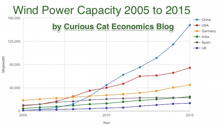
Chart by Curious Cat Economics Blog using data from the Wind Energy Association, data for 2014 and 2015. Chart may be used with attribution as specified here.
After a slowing of additional capacity added in 2013, both 2014 and 2015 saw a bit of a rebound in additions to global wind energy capacity. In 2013 capacity increased only 13% while in both 2014 and 2015 it increased 17%. Still 17% is less than any year in the last 10, except 2013.
At the end of 2013 China had 29% of global capacity (after being responsible for adding 62% of all the capacity added in 2013). In 2005 China had 2% of global wind energy capacity.
At the end of 2015 China accounted for 34% of global capacity, the only country in the top 8 increasing their share of global capacity. The USA now has 17% of capacity. Germany has 10%.
Europe moved first in adding large scale wind energy capacity but has added capacity very slowly in the last 5 years. Germany had 31% of global capacity in 2005. Spain had 17% in 2005 and now has just 5% (during that time Spain has more than doubled their wind energy capacity).
The 6 countries shown on the chart account for 76% of total wind energy capacity globally. From 2005 to 2015 those 8 countries have accounted for between 74 and 77% of total capacity – which is amazingly consistent.
Wind power now accounts for approximately 4 to 5% of total electricity used.
In 1965 foreign ownership of USA stocks totaled about 2%, in 1990 it had risen to 10% and by 2015 to 26%. That the foreign ownership is so high surprised me. Holdings in retirement accounts (defined benefit accounts, IRAs etc.) was under 10% in 1965, rose to over 30% in 1990 and to about 40% in 2015. The holdings in retirement accounts doesn’t really surprise me.
The combination of these factors (and a few others) has decreased the holding of USA stocks that are taxable in the USA from 84% in 1965 to 24% in 2015. From the report
We treated foreigners as nontaxable as their income from stock generally is not subject to U.S.tax — or subject to just a little tax. Their stock gains almost always are exempt from taxation.Their dividends are subject to a 30 percent U.S.withholding tax for portfolio investments, which is typically reduced, by treaty, to 15 percent…
As with much economic data it isn’t an easy matter to determine what values to use in order to get figures such as “foreign ownership.” Still this is very interesting data, and as the report suggests further research in this area would be useful.
Credit scores are far from a great measure of whether a person is a great credit risk for a specific loan, in my opinion. However, they are very widely used and therefor, very important. They also are somewhat useful. And lenders don’t base judgement solely on credit scores, they consider many other factors, if they have any sense at all.
Credit scores range from 300 to 850. They are calculated by various credit reporting organizations, including FICO. They factor in payment history, percent of outstanding credit available that is used, credit report checks, length of outstanding credit accounts, etc..
Peer to peer lending platform, Lending Club, limits loans to those with a minimum credit score of 660 (remember there are multiple organizations that provide credit scores, this minimum is based on Lending Club’s score). In general I see scores above 700 in A and B loans, scores from 650-700 in C and D loans. Remember the credit score is not the only factor setting the rate (you will see scores above 700 in the C loans sometimes, etc.). Credit scores provide some insight but are just 1 factor in approving loans or setting rates (an important one but not a completely dominant one).
About 38% of people have credit scores from 750-850. Another 37% from 600-749 and about 25% from 350-599.
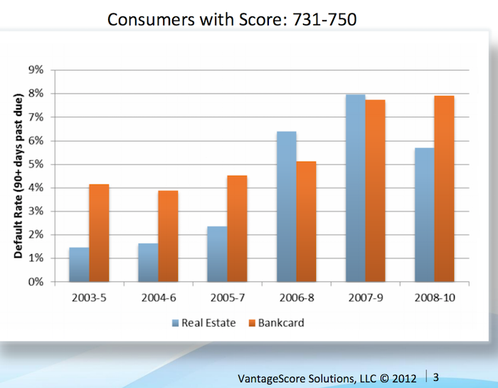
Vantage Score decided to make their score range go up to 1000, not the standard 850. Maybe a 750 score for them is comparable to 680? They say super-prime is 900+ (750-850 on more common scale), prime is 701-900 (680-739), near-prime 641-700 (620-679), subprime 501-640 (550-619). Anyway that chart shows the changing default rates from 2003 to 2010 by type of loan.
For guidance, the following table generally matches a borrower’s odds-of-default with the corresponding FICO 8 score (calculated on performance from Oct 2008 – Oct 2010). Of course, the range of scores and odds-of-default [the data is related to mortgages] will vary with each model as creditors develop and validate their own credit scoring models.
Odds-of Default
FICO 8 Score
percent of population**
5:1
610
9%
10:1
645
9%
20:1
685
6%
30:1
705
6%
40:1
720
6%
50:1
735
9%
100:1
770
30%
As you can see at a 610 level, 20 loans out of 100 defaulted. At 685 just 5 in 100 defaulted and at 770 just 1 in 100 did.
** I had to adjust this, because the report didn’t report it in this form, so it a very approximate measure (I made estimates for something like scores from 735 to 769 etc.). Again this is data from the Oct 2008 – Oct 2010 period. The rest of the population (about 25%) would have scores below 610.
This page references a Fed report (that I can’t find) that found the following default rates on new loans for the two years after origination, 2000-2002:
Credit score range
Default rate*
under 520
41%
520-559
28%
560-599
23%
600-639
16%
640-679
9%
680-719
4.4%
over 720
<1%
***
The Consumer Financial Health Study respondents were asked to self-assess their credit quality and for permission to pull their actual credit scores.8 Forty-five percent of survey participants granted permission, yielding an “opt-in” sample size of 3,215. We appended two objective measures of creditworthiness to the dataset: Experian provided VantageScore 3.0 credit scores, and LexisNexis Risk Solutions provided RiskView scores. VantageScore is a generic credit scoring model that was created by the three major credit bureaus (Equifax, Experian and TransUnion) and, in addition to tradeline data, includes rent, utility and cell phone payment data when it is available in consumer credit files.
Peer to peer lending has grown dramatically the last few years in the USA. The largest platforms are Lending Club (you get a $25 bonus if you sign up with this link – I don’t think I get anything?) and Prosper. I finally tried out Lending Club starting about 6 months ago. The idea is very simple, you buy fractional portions of personal loans. The loans are largely to consolidate debts and also for things such as a home improvement, major purchase, health care, etc.).
With each loan you may lend as little as $25. Lending Club (and Prosper) deal with all the underwriting, collecting payments etc.. Lending Club takes 1% of payments as a fee charged to the lenders (they also take fees from the borrowers).
Borrowers can make prepayments without penalty. Lending Club waives the 1% fee on prepayments made in the first year. This may seem a minor point, and it is really, but a bit less minor than I would have guessed. I have had 2% of loans prepaid with only an average of 3 months holding time so far – much higher than I would have guessed.
On each loan you receive the payments (less a 1% fee to Lending Club) as they are made each month. Those payments include principle and interest.
This chart shows the historical performance by grade for all issued loans that were issued 18 months or more before the last day of the most recently completed quarter. Adjusted Net Annualized Return (“Adjusted NAR”) is a cumulative, annualized measure of the return on all of the money invested in loans over the life of those loans, with an adjustment for estimated future losses. From LendingClub web site Nov 2015, see their site for updated data.
Lending Club provides you a calculated interest rate based on your actual portfolio. This is nice but it is a bit overstated in that they calculate the rate based only on invested funds. So funds that are not allocated to a loan (while they earn no interest) are not factored in to your return (though they actually reduce your return). And even once funds are allocated the actual loan can take quite some time to be issued. Some are issued within a day but also I have had many take weeks to issue (and some will fail to issue after weeks of sitting idle). I wouldn’t be surprised if Lending Club doesn’t start considering funds invested until the loan is issued (which again would inflate your reported return compared to a real return), but I am not sure how Lending Club factors it in.
Total nonfarm payroll employment increased by 271,000 in October, and the unemployment rate was essentially unchanged at 5.0%. Over the prior 12 months, employment growth had averaged 230,000 per month – which is quite an excellent result. We are still recovering from the job losses suffered during the great recession but even considering that the results are excellent.
The change in total nonfarm payroll employment for August was revised from +136,000 to +153,000, and the change for September was revised from +142,000 to +137,000. With these revisions, employment gains in August and September combined were 12,000 more than previously reported.
Household Survey Data
Both the unemployment rate (5.0%) and the number of unemployed persons (7.9 million) were essentially unchanged in October. Over the past 12 months, the unemployment rate dropped by 70 basis (from 5.7%) and 1.1 million fewer people are listed as unemployed.
Among the major worker groups, the unemployment rates for adult men (4.7%), adult women (4.5%), teenagers (15.9%), whites (4.4%), blacks (9.2%), Asians (3.5%), and Hispanics (6.3%) showed little or no change in October.
The number of long-term unemployed (those jobless for 27 weeks or more) was essentially unchanged at 2.1 million in October and has shown little change since June. These individuals accounted for 26.8% of the unemployed in October.
This chart shows that the percentage of millionaire families by highest education level is dramatically different by education level. The data is looking at USA family income for household headed by a person over 40. For high school dropouts, fewer than 1% are millionaires; all families it is about 5%; high school graduates about 6%; 4 year college degree about 22% and graduate or professional degree about 38%.
While the costs of higher education in the USA have become crazy the evidence still suggests education is highly correlated to income. Numerous studies still show that the investment in education pays a high return. Of course, simple correlation isn’t sufficient to make that judgement but in other studies they have attempted to use more accurate measures of the value of education to life long earnings.
Average isn’t a very good measure for economic wealth data, is is skewed horribly by the extremely wealthy, median isn’t a perfect measure but it is much better. The post includes a chart of average wealth by age which is interesting though I think the $ amounts are largely worthless (due to average being so pointless). The interesting point is there is a pretty straight line climb to a maximum at 62 and then a decline that is about as rapid as the climb in wealth.
That decline is slow for a bit, dropping, but slowly until about 70 when it drops fairly quickly. It isn’t an amazing result but still interesting. It would be nice to see this with median levels and then averaged over a 20 year period. The chart they show tells the results for some point in time (it isn’t indicated) but doesn’t give you an idea if this is a consistent result over time or something special about the measurement at the time.
They also do have a chart showing absolute wealth data as median and average to show how distorted an average is. For example, median wealth for whites 55-64 and above 65 is about $280,000 and the average for both is about $1,000,000.
The incredible policies that have created such loose credit has the world so flooded with money searching for somewhere to go that 0% is seen as attractive. This excess cash is dangerous. It is a condition that makes bubbles inflate.
Low interest rates are good for businesses seeking capital to invest. These super low rates for so long are almost certainly creating much more debt for no good purpose. And likely even very bad purposes since cash is so cheap.
One thing I didn’t realize until last month was that while the USA Federal Reserve stopped pouring additional capital into the markets by buying billions of dollars in government every month they are not taking the interest and maturing securities and reducing the massive balance sheet they have. They are actually reinvesting the interest (so in fact increasing the debt load they carry) and buying more debt anytime debt instruments they hold come due.
The Fed should stop buying even more debt than they already hold. They should not reinvest income they receive. They should reduce their balance sheet by at least $1,500,000,000,000 before they consider buying new debt.
Unless the failure to address too-big-to-fail actions (and systems that allow such action) results in another great depression threat. And if that happens again they should not take action until people responsible are sitting in jail without the possibly of bail. The last bailout just resulted in transferring billions of dollars from retires and other savers to the pockets of those creating the crisis. Doing that again when we knew that was fairly likely without changing the practices of the too-big-to-fail banks. But I would guess we will just bail them out while they sit in one of the many castles their actions at the too-big-to-fail banks bought them and big showered with more cash in the bailout from the next crisis.
How to invest in these difficult times is not an easy question to answer. I would put more money in stocks for yield (real estate investment trusts, drug companies, dividend aristocrats), I would also keep cash even if it yields 0% and actually a new category for me – peer to peer lending (which I will write about soon). Recently many dividend stocks have been sold off quite a bit (and then on top of that drug stocks sold off) so they are a much better buy today than 4 months ago. Still nothing is easy in what I see as a market with much more risk than normal.
I am almost never a fan of long term debt. I would avoid it nearly completely today (if not completely). For people that are retired and living off their dividends and interest I may have some long term debt but I would have much more in cash and short term assets (even with the very low yields). Peer to peer lending has risks but given what the fed has done to savers I would take that risk to get the larger yields. The main risk I worry about is the underwriting risk – the economic risks are fairly well known, but it is very hard to tell if the lender starts doing a poor job of underwriting.
The amount of time I spend focusing on economic data is fairly limited (compared to people doing so for a living or as a large part of their job). I stick with general rules of thumb that I can tweak a bit to let me keep up with economic conditions without a huge amount of time devoted to such efforts.
Due to my temperament; to my belief that markets often overreact in the short term; and partially to my less detailed understanding of economic data (that professionals focused on it all day) leads me to get less excited about individual data points. This is helpful for my overall investing performance, I believe.
Occasionally changing conditions require changing those rules of thumb. The 150,000 figure is one I have used for a long time; though I also adjust that for major medium term influences (such as the great recession dumped so many people out of jobs that I bumped up my “we need to add” monthly job figure to 175,000 to 200,000 to bring those people on board.
My 175,000 to 200,000 included a slight adjustment down from the 150,000 that I had made. In addition to using simple ideas like 150,000 monthly job baseline I incorporate the idea of not overreacting to variation in short term data as well as tweaking those numbers for medium term economic conditions (things like recovering from the great recession – though that is about the largest “tweaking” factor that I remember).
This article made me realize how much I should adjust my expectations for a neutral job growth reading in the USA going forward. I also gather data and opinions as I think about making major adjustments to my thinking. I’ll adjust from what I had been using of a base of 125,000 plus 50,000+ for great recession recovery to 75,000 + 50,000 for great recession recovery now (and adjust more later if other sources indicate it makes sense). The great recession recovery factor will likely go down to 25,000 for me by the end of this year.
Apple’s market cap is up $115 billion since the last list was created in October of 2014. That increase is more than 50% of the value of the 14th most valuable company in the world (in October 2014).
China Mobile increased $100 billion and moved into 6th place. Industrial and Commercial Bank of China (ICBC) increased $78 billion to move into 7th place.
Exxon Mobil lost over $50 billion (oil prices collapsed as OPEC decided to stop attempting to hold back supply in order to maximize the price of oil). Alibaba (the only non-USA company in the last list) and Walmart dropped out of the top 10.
The total value of the top 20 increased from $5.722 trillion to $6.046 trillion, an increase of $324 billion. Several companies have been replaced in the new top 20 list.
The next ten most valuable companies:
Company
Country
Market Capitalization
11
JPMorgan Chase
USA
$250 billion
12
China Construction Bank
China
$250 billion**
13
Novartis (NVS)
Switzerland
$246 billion
14
Petro China
China
$237 billion
15
Wal-Mart
USA
$236 billion
16
Tencent
China
$235 billion**
17
Nestle
Switzerland
$235 billion***
18
Facebook
USA
$231 billion
19
Hoffmann-La Roche (ROG.VX)
Switzerland
$231 billion
20
Alibaba
China
$226 billion
Market capitalization shown are of the close of business last Friday, as shown on Yahoo Finance.
The current top 10 includes 8 USA companies and 2 Chinese companies. The 11th to 20th most valuable companies includes 4 Chinese companies, 3 Swiss companies and 3 USA companies. Facebook (after increasing $21 billion), China Construction Bank (increasing $68 billion – it is hard for me to be sure what the value is, I am not sure I am reading the statements correctly but this is my best guess) and Tencent moved into the top 20; which dropped Procter & Gamble, Royal Dutch Shell and Chevron from the top 20.
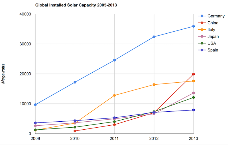
Solar energy capacity has been growing amazingly quickly the last few years. Part of the reason for this is the starting point was so low, making it easy to have large gains.
As with so many macro economic measures China has made enormous investments in solar energy the last few years. China’s increase in 2013 was larger than the USA’s total capacity at the end of 2013. Since solar energy use on a large scale is still small investments are quickly ramping up. Europe was a few years ahead of others putting countries like Germany, Spain and Italy far in the lead. China, the USA and Japan have been investing huge amounts the last few years and will likely leave those other than Germany (which already has such a large capacity) far behind very shortly.
In the USA, even after growing 60% in 2008, 53% in 2009, 71% in 2010, 86% in 2011, 83% in 2012 and 64% in 2013 solar energy capacity only totaled 1% of USA total electrical capacity. In 2013 hydropower was 6.8%, wind was 5.3% and biomass was 1.3%. The increase in solar capacity should continue to grow rapidly and is starting to make significant contributions to the macroeconomic energy picture.
When you look at total electricity generation solar only represented .5% (compared to 6.6% for hydropower 4.1% for wind and 1.5% for biomass).
USA data based on only solar capacity that is connected to the grid (and my guess would be that is the measure used in other countries too). Data is largely from that Department of energy report, with historical data for other countries pulled from previous editions.
The US Energy Information Agency (USEIA) expects the USA to add (net) 9,841 MW of wind capacity; 4,318 MW of natural gas capacity and 2,235 MW of solar in 2015. In 2015 they also predict a net decline of 12,922 MW of coal capacity. They also share that nuclear plants and natural gas combined-cycle generators having utilization factors 3 to 5 times those of wind and solar generators, which means capacity measures are significantly different from actually produced electricity measures.
The USEIA has predicted “global solar PV capacity seen rising from 98 GW in 2012 to 308 GW in 2018.” They predicted in 2018 China would have the most solar PV capacity followed by Germany, Japan and the USA.
The Solar Energy Industries Association (USA) states that 5,000 MW of solar capacity was added in the USA in 2013 and 7,000 MW in 2014. They forecast 8,000 MW to be added in 2015 and 12,000 MW in 2016.