The chart shows the oil production over the last decade by the top oil producing countries. Production totals include crude oil, shale oil, oil sands and NGLs (the liquid content of natural gas where this is recovered separately). Excludes liquid fuels from other sources such as biomass and coal derivatives.
 The chart shows the leading oil producing countries from 1999-2009. The chart created by Curious Cat Investing and Economics Blog may be used with attribution.
___________________
The chart show 3 clear leaders in production Russia, Saudi Arabia and the USA (with the USA firmly in 3rd place). Those 3 were responsible for approximately a third of the total oil production in 2009. Russia greatly increased production. During the last decade world production increased from 72 million barrels a day to 80 million barrels a day. Russia accounted for 51% of the increase, close to 4 million barrels a day.
The next 11 countries are pretty closely grouped, with slightly increasing production over the period as a group. Brazil, the last country with over 2 million barrels of production a day in 2009, has the largest percentage increase in the period, producing 79% more in 2009 than they did in 1999. Russia increase production 62% over the period. The other countries ranged from a 23% increase (Canada) to a 25% decrease (Norway). The USA increased production 7% and China increased production 18%. World production increased 11%.
Last year I posted a chart showing oil consumption by the top oil consuming countries over the last 2 decades; showing all countries using over 2 million barrels of oil a day. The USA consumed 18.7 million barrels a day in 2009. Only China was also over 5 million barrels, using 8.2 million in 2009. Japan was next at 4.4 million.
(more…)

 The chart shows gross government debt as percentage GDP from 1990-2009. By Curious Cat Investing and Economics Blog,


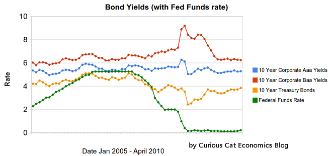 Chart showing corporate and government bond yields from 2005-2010 by Curious Cat Investing Economics Blog,