Tag: chart

  • Government Debt as Percentage of GDP 1990-2008 – USA, Japan, Germany…

    Recently Greece and the huge USA federal deficits have highlighted the problem of excessive government debt. The above chart shows gross government debt by country from the IMF.

    Korea has essentially no gross government debt (under 2% of GDP for the entire period). At the other end of the spectrum Japan has seen gross government debt rise to 197% (Japan’s 2008 figure is an IMF estimate). The IMF did not have data for Greece (which would likely look very bad) or China (which I would think would be very low – maybe even negative – the government having more assets than debt).

    The USA debt stood at 64% in 1990, 71% in 1995, 55% in 2000, 61% in 2005 and 70% in 2008. Most countries are expected to see significant increases in 2009. The IMF sees the USA going to 85% in 2009 and 100% in 2012. They see Germany at 79% in 2009 and 90% in 2012. They See the UK at 69% in 2009 and 94% in 2012. They see Japan at 237% in 2012.

    Government debt as percentage GDP 1990-2008The chart shows gross government debt as percentage GDP 1990-2008. By Curious Cat Investing and Economics Blog, Creative Commons Attribution.

    ___________________________

    The data here is very similar to the OECD data I provided earlier, Government Debt Compared to GDP 1990 to 2007, though with some notable differences. In the OECD data was still in the best shape, but is seen as having 29% debt to GDP in 2007. The IMF data attempts to avoid issues where some countries have debt of non-federal governments that are hidden when looking just at federal government debt.

    Data source: IMF data (for some countries the data is also from that site but at different urls).

    Related: The Long-Term USA Federal Budget OutlookUSA, China and Japan Lead Manufacturing Output in 2008Oil Consumption by Country in 2007Saving Spurts as Spending Slashed

  • USA, China and Japan Lead Manufacturing Output in 2008

    Once again the USA was the leading country in manufacturing in 2008. And once again China grew their manufacturing output amazingly. In a change with recent trends Japan grew output significantly. Of course, the 2009 data is going to show the impact of a very severe worldwide recession.

    Chart showing percent of output by top manufacturing countries from 1990 to 2008
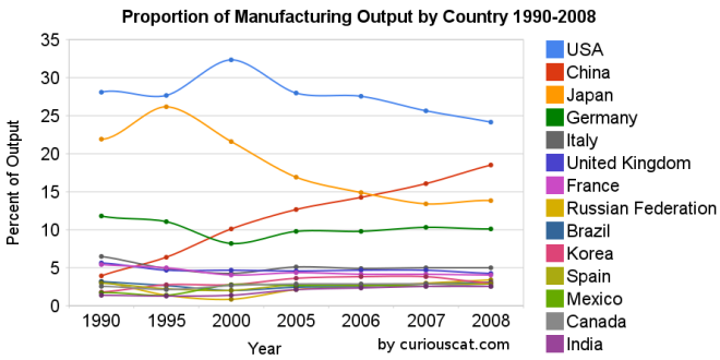
Chart showing the percentage output of top manufacturing countries from 1990-2008 by Curious Cat Management Blog, Creative Commons Attribution.

    The first chart shows the USA’s share of the manufacturing output, of the countries that manufactured over $185 billion in 2008, at 28.1% in 1990, 27.7% in 1995, 32% in 2000, 28% in 2005, 28% in 2006, 26% in 2007 and 24% in 2008. China’s share has grown from 4% in 1990, 6% in 1995, 10% in 2000, 13% in 2005, 14% in 2006, 16% in 2007 to 18% in 2008. Japan’s share has fallen from 22% in 1990 to 14% in 2008. The USA has about 4.5% of the world population, China about 20%. See Curious Cat Investment blog post” Data on the Largest Manufacturing Countries in 2008.

    Even with just this data, it is obvious the belief in a decades long steep decline in USA manufacturing is not in evidence. And, in fact the USA’s output has grown substantially over this period. It has just grown more slowly than that of China (as has every other country), and so while output in the USA has grown the percentage with China has shrunk. The percentage of manufacturing output by the USA (excluding output from China) was 29.3% in 1990 and 29.6% in 2008. The second chart shows manufacturing output over time.

    charts showing the top manufacturing countries output from 1990-2008
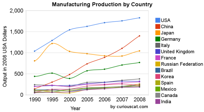
Chart showing the output of the top manufacturing countries from 1990-2008 by Curious Cat Management Blog, Creative Commons Attribution.

    The 2008 China data is not provided for manufacturing alone (the latest UN Data, for global manufacturing, in billions of current USA dollars). The percentage of manufacturing (to manufacturing, mining and utilities) was 78% for 2005-2007 (I used 78% of the manufacturing, mining and utilities figure provided in the 2008 data). There is a good chance this overstates China manufacturing output in 2008 (due to very high commodity prices in 2008).

    Hopefully these charts provide some evidence of what is really going on with global manufacturing and counteracts the hype, to some extent. Global economic data is not perfect. These figures are an attempt to capture the economic reality in the world but they are not a perfect proxy. This data is shown in 2008 USA dollars which is good in the sense that it shows all countries in the same light and we can compare the 1995 USA figure to 2005 without worrying about inflation. However foreign exchange fluctuations over time can show a country, for example, having a decline in manufacturing output in some year when in fact the output increased (just the decline against the USA dollar that year results in the data showing a decrease – which is accurate when measured in terms of USA dollars).

    If the dollar declines substantially between when the 2008 data was calculated and the 2009 data is calculated that will give result in the data showing a substantial increase in those countries that had a currency strengthen against the USA dollar. At this time the Chinese Renminbi has not strengthened while most other currencies have – the Chinese government is retaining a peg to a specific exchange rate.

    Korea (1.8% in 1990, 3% in 2008), Mexico (1.7% to 2.6%) and India (1.4% to 2.5%) were the only countries to increase their percentage of manufacturing output (other than China, of course, which grew from 3.9% to 18.5%).

    Related: posts on manufacturingGlobal Manufacturing Data by Country (2007)Global Manufacturing Employment Data – 1979 to 2007Top 10 Manufacturing Countries 2006Top 10 Manufacturing Countries 2005

  • The USA Pays Double for Worse Health Results

    This graphic from the National Geographic shows the amazingly high cost of health care in the USA and the poor performance. Granted just life expectancy is not a good overall measure of success. But this just mirrors the general mediocre at best performance of the USA health care system.

    Chart of health care cost versus life expectancy by country

    The USA spends $7,290 per person (based on 2007 OECD data) the next highest spending country is Switzerland at $4,417. Canada spends the 4th most: $3,895. Only 5 countries have a lower life expectancy. The most any of those countries spend is $1,626. How people continue to accept arguments by the apologists for the special interests trying to defend the current system is beyond me.

    The Cost of Care by Michelle Andrews

    The United States spends more on medical care per person than any country, yet life expectancy is shorter than in most other developed nations and many developing ones. Lack of health insurance is a factor in life span and contributes to an estimated 45,000 deaths a year. Why the high cost? The U.S. has a fee-for-service system – paying medical providers piecemeal for appointments, surgery, and the like. That can lead to unneeded treatment that doesn’t reliably improve a patient’s health. Says Gerard Anderson, a professor at Johns Hopkins Bloomberg School of Public Health who studies health insurance worldwide, “More care does not necessarily mean better care.”

    Related: USA Spent $2.2 Trillion, 16.2% of GDP, on Health Care in 2007Employees Face Soaring Health Insurance CostsInternational Health Care System PerformanceUSA Heath Care System Needs Reform

  • 30 Year Fixed Rate Mortgage Rates Remain Low

    30 year fixed mortgage rates have declined a bit over the last few months and remain at very low levels.

    30 year fixed mortgage rate chart 2000-2009

    The poor economy, Unemployment Rate Reached 10.2%, has the Fed continuing massive intervention into the economy. The Fed is keeping the fed funds rate at close to 0% (.12% in October). They also continue to hold massive amounts of long term government and mortgage debt (in order to suppress interest rates on long term bonds – by reducing the supply of such bonds in the market).

    I can’t see how lending US dollars, over the long term, at 5%, makes any sense. I would much rather borrow at those rates than lend. If you have not refinanced yet, doing so now may well make sense. And if you are looking at a new real estate purchase, financing a 30 year mortgage sure is attractive at rates close to 5%.

    Related: historical comparison of 30 year fixed mortgage rates and the federal funds rateLowest 30 Year Fixed Mortgage Rates in 37 YearsJumbo v. Regular Fixed Mortgage Rates: by Credit ScoreWhat are mortgage definitionsIgnorance of Many Mortgage Holders

    For more data, see graphs of the federal funds rate versus mortgage rates for 1980-1999. Source data: federal funds rates30 year mortgage rates

  • Government Debt Compared to GDP 1990-2007

    Government debt as percent of GDP 1990-2007Chart showing government debt as a percentage of GDP by Curious Cat Investing Economics Blog, Creative Commons Attribution, data from OECD, Sept 2009.
                    

    For 2007 most countries slightly decreased their government debt to GDP ratio – as economic growth exceeded debt growth. The OECD is made up of countries in Europe and the USA, Japan, Korea, Australia, New Zealand and Canada. The overall OECD debt to GDP ratio decreased from 77% in 2005 to 75% in 2007. The USA moved in the opposite direction increasing from 62% to 63%: still remaining far below the OECD total. Most likely 2008, 2009 and 2010 will see both the USA and other OECD national dramatically increase the debt burden.

    Compared to the OECD countries the USA is actually better than average. The chart shows the percentage of GDP that government debt represents for various countries. The USA ended 2007 at 63% while the overall OECD total is 75%. In 1990 the USA was at 63% and the OECD was at 57%. Japan is the line way at the top with a 2007 total of 171% (that is a big problem for them). Korea is in the best shape at just a 29% total in 2007 but that is an increase from just 8% in 1990.

    Related: Government Debt as a Percentage of GDP Through 2006Oil Consumption by Country in 2007Federal Deficit To Double This YearPoliticians Again Raising Taxes On Your ChildrenTrue Level of USA Federal DeficitTop 12 Manufacturing Countries in 2007
    (more…)

  • Loan Delinquency Rates Increased Dramatically in the 2nd Quarter

    chart of loan default rates 1998 to 2009Chart showing loan delinquency rates for real estate, consumer and agricultural loans for 1998 to 2009 by the Curious Cat Investing Economics Blog, Creative Commons Attribution, data from the Federal Reserve.

    Delinquency rates on commercial (up another 151 basis points) and residential (93 basis points) real estate continued to increase dramatically in the second quarter. Credit card delinquency rates increased but only by 20 basis points.

    Real estate delinquency rates exploded in 2008. In the 4th quarter of 2007 residential delinquency rates were 3.02% by the 4th quarter of 2008 they were 6.34% and in the 2nd quarter of this year they were 8.84% (582 basis points above the 4th quarter of 2007). Commercial real estate delinquency rates were at 2.74% in the 4th quarter of 2007, 5.43% in the fourth quarter of 2008 and 7.91% in the 2nd quarter of 2009 (a 517 basis point increase).

    Credit card delinquency rates were much higher than real estate default rates for the last 10 years (the 4-5% range while real estate hovered above or below 2%). Now they are over 200 and 300 basis points bellow residential and commercial delinquency rates respectively. From 4.8% in the 3rd quarter 2008 to 5.66% in the 4th and 6.5% in the 1st quarter of 2009.

    The delinquency rate on other consumer loans and agricultural loan delinquency rates are up but nowhere near the amounts of real estate or credit cards.

    As I wrote recently bond yields in the last few months show a dramatic increase in investor confidence for corporate bonds.

    Data from the Federal Reserve

    Related: Loan Delinquency Rates: 1998-2009The Impact of Credit Scores and Jumbo Size on Mortgage Rates30 Year Mortgage Rate and Federal Funds Rate Chart

  • 2nd Quarter USA GDP down 1%

    chart of 2005-2009 quarterly gdp changesChart from the Bureau of Economic Analysis showing the quarter to quarter growth in real GDP from 2005-2009.

    Current-dollar GDP — the market value of the nation’s output of goods and services — decreased 1.0%, or $34.7 billion, in the second quarter to a level of $14,143.3 billion. In the first quarter, current-dollar GDP decreased 4.6%, or $169.3 billion.

    More details on 2nd quarter, 2009 GDP.

    Related: First Quarter GDP 2009 down 6.1%Economists Raise Projections for Second Half of 2009What the Bailout and Stimulus Are and Are Not

  • Capacity Utilization Rate Up Slightly From All Time Low

    chart of USA capacity utilization rate 1972-2009The chart shows the capacity utilization rate in the USA. By Curious Cat Investing Economics Blog, Creative Commons Attribution, data from the Federal Reserve.

    Industrial production increased .5% in July and capacity utilization rate increased to 68.5% from an all time low of 68.1%. Capacity utilization has averaged 80.9% from 1972 to today.

    Manufacturing output increased 1.0% in July but remained 14.4% lower than its year-earlier level. The factory operating rate rose to 65.4% in July, 70 basis points above the historical low recorded in June; the series begins in 1948. Production in durable goods industries advanced 2.2% in July. In addition to the sharp increase in motor vehicles and parts output, large production gains occurred for nonmetallic mineral products and for primary metals. The indexes for wood products, computer and electronic products, aerospace and miscellaneous transportation equipment, furniture and related products, and miscellaneous goods also rose. The indexes for fabricated metal products, machinery, and electrical equipment declined.

    The production of nondurable goods fell 0.1% in July. The indexes for textile and product mills and for printing and support recorded sizable declines; the indexes for food, beverages, and tobacco and for petroleum and coal products also declined. The output of paper, of chemicals, and of plastic and rubber products increased.

    The index for other manufacturing, which consists of publishing and logging, was down 0.6% in July.

    The output of electric and gas utilities decreased 2.4%, and the operating rate for utilities dropped 21 basis points, to 77.6%. Mining production moved up 0.8%; its utilization rate in July, at 81.7%, was 59 basis points below its 1972-2008 average.

    Data from the St. Louis Federal Reserve and Federal Reserve August 14th Industrial Production and Capacity Utilization press release.

    Related: Loan Default Rates: 1998-2009Government Debt as a Percentage of GDPUSA Spent $2.2 Trillion, 16.2% of GDP, on Health Care in 2007
    (more…)

  • Bond Yields Show Dramatic Increase in Investor Confidence

    graph of 10 year Aaa, Baa and corporate bond rates from 2005-2009
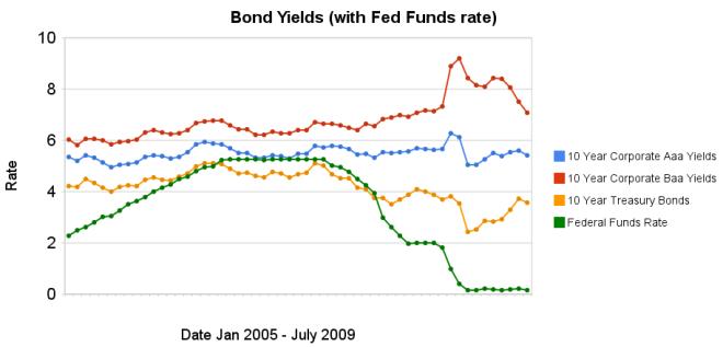
Chart showing corporate and government bond yields by Curious Cat Investing Economics Blog, Creative Commons Attribution, data from the Federal Reserve.

    The changes in bond yields over the last 3 months months indicate a huge increase in investor confidence. The yield spread between corporate Baa 10 year bonds and 10 year treasury bonds increased 304 basis points from July 2008 to December 2008, indicating a huge swing in investor sentiment away from risk and to security (US government securities). From April 2009 to July 2009 the yield spread decreased by 213 basis points showing investors have moved away from government bonds and into Baa corporate bonds.

    From April to July 10 year corporate Aaa yields have stayed essentially unchanged (5.39% to 5.41% in July). Baa yields plunged from 8.39% to 7.09%. And 10 year government bond yields increased from 2.93% to 3.56%. federal funds rate remains under .25%.

    Investors are now willing to take risk on corporate defaults for a much lower premium (over government bond yields) than just a few months ago. This is a sign the credit crisis has eased quite dramatically, even though it is not yet over.

    Data from the federal reserve: corporate Aaacorporate Baaten year treasuryfed funds

    Related: Continued Large Spreads Between Corporate and Government Bond Yields (April 2009)Chart Shows Wild Swings in Bond Yields (Jan 2009)investing and economic charts

  • Loan Default Rates: 1998-2009

    chart of loan default rates 1998 to 2009
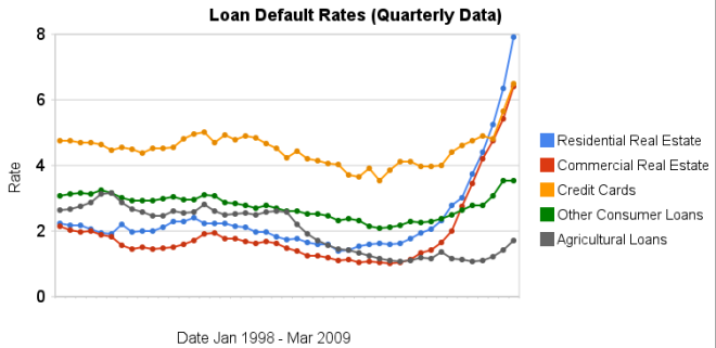
Chart showing loan default rates for real estate, consumer and agricultural loans for 1998 to 2009 by the Curious Cat Investing Economics Blog, Creative Commons Attribution, data from the Federal Reserve.

    As you can see real estate default rates exploded in 2008. In the 4th quarter of 2007 residential default rates were 3.02% by the 4th quarter of 2008 they were 6.34% and in the 1st quarter of this year they were 7.91% (471 basis points above the 4th quarter of 2007). Commercial real estate default rates were at 2.74 in the 4th quarter of 2007, 5.43% in the fourth quarter of 2008 and 6.5% in the 1st quarter of 2009 (a 366 basis point increase).

    Credit card default rates were much higher for the last 10 years (the 4-5% range while real estate hovered above or below 2%). In the last 2 quarters it has increased sharply. From 4.8% in the 3rd quarter 2008 to 5.66% in the 4th and 6.5% in the 1st quarter of 2009. The default rate on other consumer loans are up but nowhere near the amounts of real estate or credit cards.

    Agricultural loan default rates are actually about as low now as they have every been 1.71%. That is up a bit from the 1.06% low the default rate hit in the 1st quarter of 2009 but actually lower than it was for half of the last decade (the last 5 years it has been lower but prior to that it was higher – in fact with higher default rates than either real estate loan category).

    Data from the Federal Reserve

    Related: Mortgage Rates: 6 Month and 5 Year ChartsJumbo Loan Defaults Rise at Fast PaceContinued Large Spreads Between Corporate and Government Bond YieldsNearly 10% of Mortgages Delinquent or in Foreclosure