Tag: USA

  • The Benefits and Risks of Countries Taking on Government Debt

    Chart of government debt 1990 to 2015 for Japan, USA, Italy...

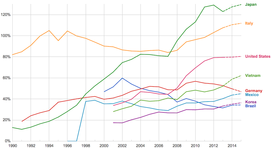
    The data, from IMF, does not include China or India.

    The chart shows data for net debt (gross debt reduced by certain assets: gold, currency deposits, debt securities etc.).

    Viewing our post on the data in 2014 we can see that the USA improved on the expectations, managing to hold net debt to 80% instead of increasing to 88% as expected. Nearly every country managed to take on less debt than predicted (Vietnam took on more, but is very low so this is not a problem).

    Taking on debt to invest in valuable resources (building roads, mass transit, internet infrastructure, education, environmental regulation and enforcement, health care, renewable energy…) that will boost long term economic performance can be very useful. The tricky part is knowing the debt levels doesn’t tell you whether the debt was taken on for investment or just to let current taxpayers send the bills for their consumption to their grandchildren.

    Also government debt can become a huge burden on the economy (especially if the debt is owed outside the country). The general consensus today seems to be that 100% net debt level is the maximum safe amount and increasing beyond that gets riskier and riskier.

    (more…)

  • Solar Energy Capacity Continues to Grow Rapidly (Chart of Data by Country)

    Solar energy capacity has been growing amazingly quickly the last few years. Part of the reason for this is the starting point was so low, making it easy to have large gains.

    Chart of solar pv capacity by country 2009 to 2015
    Chart by Curious Cat Economics Blog using data from the International Energy Agency (IEA) and the US Department of Energy. Chart may be used with attribution as specified here.

    The 2014 and 2015 data on this chart is from IAE report for total installed photovoltaic (PV) solar capacity. See previous post on chart of Solar Energy Capacity by Country from 2009 to 2013. Different data sources for different year (and/or countries in the same year) is not ideal but for the purposes of this data in this post is sufficient.

    Installed PV capacity is even more questionable that much other economic data. Economic data are always approximations of reality but with PV you have additional questions. The same plant located outside London or Rome have different capability to produce (and there are many factors that contribute not just the most obvious such as how much sun shines in a particular geography). Installed PV data is based on the capability of the equipment regardless of the solar potential of the location.

    So even with the same investment it is likely Italy gets more production than Germany. The IAE report attempted to determine what was the likely ability of the solar PV capacity to produce for each country as a percentage of total electricity needs. They estimate Italy has the largest percentage of electricity needs capable of being produced by installed PV systems at 8%, with Greece at 7.4% and Germany at 7.1%. Japan is ranked 5th at just under 4%, UK is 12th at 2.5%, China is 22nd at 1%, India 24th and the USA 25th at close to .9%. They estimate the total global percentage at 1.3%.

    These figures also show the huge power needs of China and the USA. Even with huge investments in Solar they us so much electricity that it is slow to make large gains in the percentage of total power generated by solar.

    In the USA in 2013 solar energy capacity was under 1% USA total electrical capacity. In 2013 hydropower was 6.8%, wind was 5.3% and biomass was 1.3%. The increase in solar capacity should continue to grow rapidly and is making significant contributions to the macroeconomic energy picture (even if it doesn’t appear dramatic).

    Related: Chart of Global Wind Energy Capacity by Country from 2005 to 2015Leasing or Purchasing a Solar Energy System For Your HouseNuclear Power Generation by Country from 1985-2010Manufacturing Output by Country 1999-2011: China, USA, Japan, Germany

  • USA Health-Care System Ranks 50th out of 55 Countries

    Even if some lobbyists and their friends in Washington DC try to distract from the long term failure of the USA health care system the data continues to pour in about how bad it is.

    U.S. Health-Care System Ranks as One of the Least-Efficient

    America was 50th out of 55 countries in 2014, according to a Bloomberg index that assesses life expectancy, health-care spending per capita and relative spending as a share of gross domestic product. Expenditures averaged $9,403 per person, about 17.1 percent of GDP, that year — the most recent for which data are available — and life expectancy was 78.9. Only Jordan, Colombia, Azerbaijan, Brazil and Russia ranked lower.

    None of these rankings are perfect and neither is this one. But it is clear beyond any doubt that the USA healthcare system is extremely costly for no better health results than other rich countries (and even more expensive with again no better results than most poor countries). It is a huge drain on the economy that we continue to allow lobbyists and special interests to take advantage of the rest of us via the Democrats and Republican parties actions over the last few decades.

    We have to improve. The costs imposed on everyone to support those benefiting from this decades old transfer of economic wealth to health care special interests should no longer be accepted.

    The top 5 countries are: Hong Kong, Singapore, Spain, South Korea and Japan. The first four have costs about 25% of the USA. Japan costs about 40% of the USA per person cost.

    Mylan’s despicable actions with Epi-pen and the direct participation of both political parties in increasing the costs foisted on the health care system by Mylan is just one in hundreds of the individual actions that continue to saddle the rest of USA economy with huge costs.

    Related: Out of Pocket “Maximum”, Understanding USA Health Care CostsDecades Later The USA Health Care System is Still a Deadly Disease for Our Economy2015 Health Care Price Report, Costs in the USA and ElsewhereUSA Health Care Spending 2013: $2.9 trillion $9,255 per person and 17.4% of GDPUSA Spends $7,960 Compared to Around $3,800 for Other Rich Countries on Health Care with No Better Health Results (2009 data)

  • Foreign Ownership of USA Stocks Reached 26% in 2015

    The report, The Dwindling Taxable Share Of U.S. Corporate Stock, from the Brookings Institution Tax Policy Center includes some amazing data.

    Graph showing the percent of foreign, tax-free and taxable holdings of USA stocks over time

    In 1965 foreign ownership of USA stocks totaled about 2%, in 1990 it had risen to 10% and by 2015 to 26%. That the foreign ownership is so high surprised me. Holdings in retirement accounts (defined benefit accounts, IRAs etc.) was under 10% in 1965, rose to over 30% in 1990 and to about 40% in 2015. The holdings in retirement accounts doesn’t really surprise me.

    The combination of these factors (and a few others) has decreased the holding of USA stocks that are taxable in the USA from 84% in 1965 to 24% in 2015. From the report

    We treated foreigners as nontaxable as their income from stock generally is not subject to U.S.tax — or subject to just a little tax. Their stock gains almost always are exempt from taxation.Their dividends are subject to a 30 percent U.S.withholding tax for portfolio investments, which is typically reduced, by treaty, to 15 percent…

    As with much economic data it isn’t an easy matter to determine what values to use in order to get figures such as “foreign ownership.” Still this is very interesting data, and as the report suggests further research in this area would be useful.

    Related: There is No Such Thing as “True Unemployment Rate”The 20 Most Valuable Companies in the World – February 2016 (top 10 all based in the USA)Why China’s Economic Data is QuestionableData provides an imperfect proxy for reality (we often forget the proxy nature of data)

  • Curious Cat Tax Proposals

    We have tax plans from the major USA Presidential candidates. I don’t like any of them, though I actually like Ted Cruz’s plan more than the others, but it has a huge problem. His plan doesn’t fund the government he wants, not even just as poorly as we have been doing. He would increase the debt substantially.

    My plan would have 3 parts. I like a flat tax, I doubt it will ever happen, but if we could get one I would be happy. Cruz proposes that (at 10%). I am fine with his proposal to eliminate all deductions but mortgage interest and charity. I would definitely tweak that some – no more than $50,000 in mortgage interest deduction a year and the same for charity. Basically subsidizing it a bit for the non-rich is fine. Subsidizing these for the rich seems silly so I would cap the deductions in some way. I also wouldn’t mind an almost flat tax, say 12% up to $200,000 and 15% after that (or some such rates).

    Cruz’s rate is far too low given the government he wants. The government budget is largely: Social Security, Medicare and Military. Then you also have debt payment which have to be paid. Those 4 things are over 80% of the spending. All the other things are just in the last 20%, you can cut some of that but realistically you can’t cut much (in percentage terms – you can cut hundreds of billions theoretically but it is unlikely and even if you did it isn’t a huge change).

    We are piling on more debt than we should. Therefore we should increase revenue, not reduce it. But if we can’t increase it (for political reasons) we definitely should not reduce it until we have shown that we have cut spending below revenue for 2 full years. After that, great, then decrease rates.

    view of the White House, Washington DC
    The White House, Washington DC by John Hunter. See more of my photos of Washington DC.

    The VAT tax on businesses replacing the corporate tax system is in Cruz’s plan and this is the best option for corporate taxes in my opinion. Another decent option is just to pass through all the earnings to the owners (I first heard this proposal from my Economics professor in College) and tax them on the earnings.

    Increasing the giveaways to trust-fund baby as Cruz and Trump propose is the single worst tax policy change that can be made. I have explained previously how bad an idea this is: The estate tax is the most capitalist tax that exists. The trust-fund-baby favors should be reduced not increased. I would roll back to the Reagan Administration policy on estate tax rates.

    (more…)

  • In the USA More Education is Highly Correlated with More Wealth

    This chart shows that the percentage of millionaire families by highest education level is dramatically different by education level. The data is looking at USA family income for household headed by a person over 40. For high school dropouts, fewer than 1% are millionaires; all families it is about 5%; high school graduates about 6%; 4 year college degree about 22% and graduate or professional degree about 38%.

    Chart of wealth by education level in the USA
    Interesting chart based on Federal Reserve data (via the Wall Street Journal)

    While the costs of higher education in the USA have become crazy the evidence still suggests education is highly correlated to income. Numerous studies still show that the investment in education pays a high return. Of course, simple correlation isn’t sufficient to make that judgement but in other studies they have attempted to use more accurate measures of the value of education to life long earnings.

    Related: The Time to Payback the Investment in a College Education in the USA Today is Nearly as Low as Ever, SurprisinglyLooking at the Value of Different College DegreesEngineering Graduates Earned a Return on Their Investment In Education of 21%

    The blog post with the chart, Why Wealth Inequality Is Way More Complicated Than Just Rich and Poor has other very interesting data. Go read the full post.

    Average isn’t a very good measure for economic wealth data, is is skewed horribly by the extremely wealthy, median isn’t a perfect measure but it is much better. The post includes a chart of average wealth by age which is interesting though I think the $ amounts are largely worthless (due to average being so pointless). The interesting point is there is a pretty straight line climb to a maximum at 62 and then a decline that is about as rapid as the climb in wealth.

    That decline is slow for a bit, dropping, but slowly until about 70 when it drops fairly quickly. It isn’t an amazing result but still interesting. It would be nice to see this with median levels and then averaged over a 20 year period. The chart they show tells the results for some point in time (it isn’t indicated) but doesn’t give you an idea if this is a consistent result over time or something special about the measurement at the time.

    They also do have a chart showing absolute wealth data as median and average to show how distorted an average is. For example, median wealth for whites 55-64 and above 65 is about $280,000 and the average for both is about $1,000,000.

    Related: Highest Paying Fields at Mid Career in USA: Engineering, Science and MathWealthiest 1% Continue Dramatic Gains Compared to Everyone ElseCorrelation is Not Causation: “Fat is Catching” Theory Exposed

  • USA T-Bills Sold by Treasury with 0% Rate for First Time Ever

    European government debt has been sold at negative interest rates recently. The United States Treasury has now come as close to that as possible with 0% 3 month T-bills in the latest auction.

    The incredible policies that have created such loose credit has the world so flooded with money searching for somewhere to go that 0% is seen as attractive. This excess cash is dangerous. It is a condition that makes bubbles inflate.

    Low interest rates are good for businesses seeking capital to invest. These super low rates for so long are almost certainly creating much more debt for no good purpose. And likely even very bad purposes since cash is so cheap.

    One thing I didn’t realize until last month was that while the USA Federal Reserve stopped pouring additional capital into the markets by buying billions of dollars in government every month they are not taking the interest and maturing securities and reducing the massive balance sheet they have. They are actually reinvesting the interest (so in fact increasing the debt load they carry) and buying more debt anytime debt instruments they hold come due.

    The Fed should stop buying even more debt than they already hold. They should not reinvest income they receive. They should reduce their balance sheet by at least $1,500,000,000,000 before they consider buying new debt.

    Unless the failure to address too-big-to-fail actions (and systems that allow such action) results in another great depression threat. And if that happens again they should not take action until people responsible are sitting in jail without the possibly of bail. The last bailout just resulted in transferring billions of dollars from retires and other savers to the pockets of those creating the crisis. Doing that again when we knew that was fairly likely without changing the practices of the too-big-to-fail banks. But I would guess we will just bail them out while they sit in one of the many castles their actions at the too-big-to-fail banks bought them and big showered with more cash in the bailout from the next crisis.

    How to invest in these difficult times is not an easy question to answer. I would put more money in stocks for yield (real estate investment trusts, drug companies, dividend aristocrats), I would also keep cash even if it yields 0% and actually a new category for me – peer to peer lending (which I will write about soon). Recently many dividend stocks have been sold off quite a bit (and then on top of that drug stocks sold off) so they are a much better buy today than 4 months ago. Still nothing is easy in what I see as a market with much more risk than normal.

    I am almost never a fan of long term debt. I would avoid it nearly completely today (if not completely). For people that are retired and living off their dividends and interest I may have some long term debt but I would have much more in cash and short term assets (even with the very low yields). Peer to peer lending has risks but given what the fed has done to savers I would take that risk to get the larger yields. The main risk I worry about is the underwriting risk – the economic risks are fairly well known, but it is very hard to tell if the lender starts doing a poor job of underwriting.

    Related: The Fed Should Raise the Fed Funds RateToo-Big-to-Fail Bank Created Great Recession Cost Average USA Households $50,000 to $120,000Buffett Calls on Bank CEOs and Boards to be Held ResponsibleHistorical Stock Returns

  • Adding 50,000 Jobs a Month is the New 150,000 in the USA Due to Demographic Changes

    For job growth, 33,000 — not 150,000 — is the new normal

    To absorb today’s slower growing population, we only need about 50,000 net jobs a month, not 150,000. In the next few years, the standard will fall to about 33,000.

    the Census Bureau predicts the working-age population will grow just 50,000 per month over the next 15 years.

    The amount of time I spend focusing on economic data is fairly limited (compared to people doing so for a living or as a large part of their job). I stick with general rules of thumb that I can tweak a bit to let me keep up with economic conditions without a huge amount of time devoted to such efforts.

    Due to my temperament; to my belief that markets often overreact in the short term; and partially to my less detailed understanding of economic data (that professionals focused on it all day) leads me to get less excited about individual data points. This is helpful for my overall investing performance, I believe.

    Occasionally changing conditions require changing those rules of thumb. The 150,000 figure is one I have used for a long time; though I also adjust that for major medium term influences (such as the great recession dumped so many people out of jobs that I bumped up my “we need to add” monthly job figure to 175,000 to 200,000 to bring those people on board.

    My 175,000 to 200,000 included a slight adjustment down from the 150,000 that I had made. In addition to using simple ideas like 150,000 monthly job baseline I incorporate the idea of not overreacting to variation in short term data as well as tweaking those numbers for medium term economic conditions (things like recovering from the great recession – though that is about the largest “tweaking” factor that I remember).

    This article made me realize how much I should adjust my expectations for a neutral job growth reading in the USA going forward. I also gather data and opinions as I think about making major adjustments to my thinking. I’ll adjust from what I had been using of a base of 125,000 plus 50,000+ for great recession recovery to 75,000 + 50,000 for great recession recovery now (and adjust more later if other sources indicate it makes sense). The great recession recovery factor will likely go down to 25,000 for me by the end of this year.

    Related: There is No Such Thing as “True Unemployment Rate”Long Term View of Manufacturing Employment in the USA (2012)USA Individual Earnings Levels for 2011: Top 1% $343,000, 5% $154,000, 10% $112,000, 25% $66,000GDP Growth Per Capita for Selected Countries from 1970 to 2010 (Korea, China, Singapore, Indonesia, Brazil

  • USA Tax Rules When Selling a House

    When you sell your primary residence in the USA you are able to exclude $250,000 in capital gains (or $500,000 if you file jointly). The primary test of whether it is your primary residence is if you lived there 2 of the last 5 years (see more details from the IRS). You can’t repeat this exemption for 2 years (I believe).

    It doesn’t matter if you buy another house or not, that exclusion of up to $250,000 is all that can be excluded (you must pay tax on anything above that amount – taxed at capital gains rates for long term gains).

    photo of a house

    For investment property you can do 1031 exchanges which defers capital gains taxes. Otherwise capital gains will be taxed as you would expect (as capital gains).

    When you inherit a house the tax basis will be “stepped up” to the current market rate. So if you then sell your basis isn’t what the owner paid for it, but what it was worth when it was given to you.

    Related: Looking for Yields in Stocks and Real EstateYour Home as an InvestmentHome Values and Rental Rates

  • The 20 Most Valuable Companies in the World – June 2015

    The 10 publicly traded companies with the largest market capitalizations. Since October of last year the top 20 list has seen quite a bit of profit for stockholders (mainly in Apple and Chinese companies).

    Company Country Market Capitalization
    1 Apple USA $741 billion
    2 Microsoft USA $374 billion
    3 Google USA $370 billion
    4 Exxon Mobil USA $352 billion
    5 Berkshire Hathaway USA $346 billion
    6 China Mobile China $340 billion*
    7 Industrial & Commercial Bank of China China $306 billion**
    8 Wells Fargo USA $292 billion
    9 GE USA $275 billion
    10 Johnson & Johnson USA $273 billion

    Apple’s market cap is up $115 billion since the last list was created in October of 2014. That increase is more than 50% of the value of the 14th most valuable company in the world (in October 2014).

    China Mobile increased $100 billion and moved into 6th place. Industrial and Commercial Bank of China (ICBC) increased $78 billion to move into 7th place.

    Exxon Mobil lost over $50 billion (oil prices collapsed as OPEC decided to stop attempting to hold back supply in order to maximize the price of oil). Alibaba (the only non-USA company in the last list) and Walmart dropped out of the top 10.

    The total value of the top 20 increased from $5.722 trillion to $6.046 trillion, an increase of $324 billion. Several companies have been replaced in the new top 20 list.

    The next ten most valuable companies:

    Company Country Market Capitalization
    11 JPMorgan Chase USA $250 billion
    12 China Construction Bank China $250 billion**
    13 Novartis (NVS) Switzerland $246 billion
    14 Petro China China $237 billion
    15 Wal-Mart USA $236 billion
    16 Tencent China $235 billion**
    17 Nestle Switzerland $235 billion***
    18 Facebook USA $231 billion
    19 Hoffmann-La Roche (ROG.VX) Switzerland $231 billion
    20 Alibaba China $226 billion

    Market capitalization shown are of the close of business last Friday, as shown on Yahoo Finance.

    The current top 10 includes 8 USA companies and 2 Chinese companies. The 11th to 20th most valuable companies includes 4 Chinese companies, 3 Swiss companies and 3 USA companies. Facebook (after increasing $21 billion), China Construction Bank (increasing $68 billion – it is hard for me to be sure what the value is, I am not sure I am reading the statements correctly but this is my best guess) and Tencent moved into the top 20; which dropped Procter & Gamble, Royal Dutch Shell and Chevron from the top 20.

    Related: Historical Stock ReturnsGlobal Stock Market Capitalization from 2000 to 2012Stock Market Capitalization by Country from 1990 to 2010Solar Energy Capacity by Country (2009-2013)

    A few other companies of interest (based on their market capitalization):

    (more…)