Tag: economic data

  • Global Stock Market Capitalization from 2000 to 2012

    Looking at stock market capitalization by country gives some insight into how countries, and stocks, are doing. Looking at the total market capitalization by country doesn’t equate to the stock holdings by individuals in a country or the value of companies doing work in a specific country. Some countries (UK and Hong Kong, for example) have more capitalization based there than would be indicated by the size of their economy.

    It is important to keep in mind the data is in current USA dollars, so big swings in exchange rates can have a big impact (and can cause swings to be exacerbated when they move in tandem with stock market movements – if for example the market declines by 15% and the currency declines by 10% against the US dollar those factors combine to move the result down).

    Chart of stock market capitalization from 2000 to 2012 for USA, China, Japan, UK and world
    The chart shows the top four countries based on stock market capitalization, with data from 200 to 2012. The chart created by Curious Cat Investing and Economics Blog may be used with attribution. Data from the World Bank.

    As with so much recent economic data China’s performance here is remarkable. China grew from 1.8% of world capitalization in 2000 to 6.9% in 2012. And Hong Kong’s data is reported separately, as it normally is with global data sets. Adding Hong Kong to China’s totals would give 3.7% in 2000 with growth to to 8.9% in 2012 (Hong Kong stayed very stable – 1.9% in 2000, 2% in 2012). China alone (without HK) is very slightly ahead of Japan.

    The first chart shows the largest 4 market capitalizations (2012: USA $18.6 trillion, China and Japan at $3.7 trillion and UK at $3 trillion). Obviously the dominance of the USA in this metric is quite impressive the next 7 countries added together don’t quite reach the USA’s stock market capitalization. I also including the data showing the global stock market capitalization divided by 3 (I just divide it by three to have the chart be more usable – it lets us see the overall global fluctuations but doesn’t cram all the other data in the lower third of the chart).

    Canada is the 5th country by market capitalization (shown on the next chart) with $2 trillion. From 2000 to 2012 China’s market capitalization increased by $3.1 trillion. The USA increased by $3.6 trillion from a much larger starting point. China increased by 536% while the USA was up 23.5%. The world stock market capitalization increased 65% from 2000 to 2012.

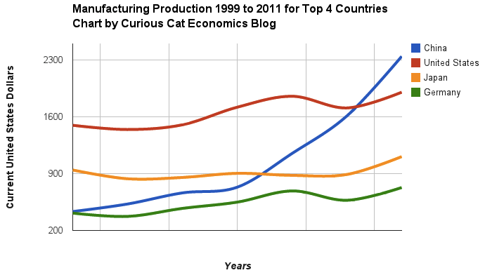
    Related: Stock Market Capitalization by Country from 1990 to 2010Government Debt as Percent of GDP 1998-2010Manufacturing Output by Country 1999-2011: China, USA, Japan, Germany

    (more…)

  • Chart of Global Wind Energy Capacity by Country 2005 to 2012

    Global wind power capacity has increased 391% from 2005 to 2012. The capacity has grown to over 3% of global electricity needs.

    chart of global wind power capacity by country from 2005 to 2012
    Chart by Curious Cat Economics Blog using data from the Wind Energy Association. Chart may be used with attribution as specified here.

    The 8 countries shown on the chart account for 82% of total wind energy capacity globally. From 2005 to 2012 those 8 countries have accounted for between 79 and 82% of total capacity – which is amazingly consistent.

    Japan and Brazil are 13th and 15th in wind energy capacity in 2012 (both with just over one third of France’s capacity). Japan has increased capacity only 97% from 2005 to 2012 and just 13% from 2010 to 2012. Globally wind energy capacity increased 41% from 2010 to 2012. The leading 8 countries increased by 43% collectively lead by China increasing by 68% and the USA up by 49%. Germany added only 15% from 2010 through 2012 and Spain just 10%.

    Brazil has been adding capacity quickly – up 170% from 2010 through 2012, by far the largest increase for a county with significant wind energy capacity. Mexico, 24th in 2012, is another country I would expect to grow above the global rate in the next 10 years (I also expect Brazil, India and Japan to do so).

    In 2005 China accounted for 2% of wind energy capacity globally they accounted for 30% in 2012. The USA went from 15% to 24%, Germany from 31% to 12%, Spain from 17% to 9% and India from 8% to 7%.

    Related: Global Wind Energy Capacity Exceeds 2.5% of Global Electricity Needs (2011)Nuclear Power Generation by Country from 1985-2010Chart of Wind Power Generation Capacity Globally 2005 to 2012 (through June)

  • Eurozone Unemployment at 12.2% and for Those Under 25 is 24.4%

    Eurozone unemployment hits new high with quarter of under-25s jobless

    The problem was most extreme in Greece where almost two-thirds of those under-25 are unemployed. The rate was 62.5% in February, the most recently available data.

    Youth unemployment in Spain is 56.4%, in Portugal 42.5%. Italy recorded its highest overall unemployment rate since records began in 1977, at 12%, with youth joblessness at 40.5%. Economists said that the rise in unemployment was fairly broad-based with rises in so-called core countries as well, including Belgium and the Netherlands. The rate in France was 11%.

    Ireland recorded one of the biggest falls in unemployment, down to 13.5% from 14.9% a year ago. That compares with a rate of 7.7% for the UK, where youth unemployment is 20.2%. The lowest rates for youth unemployment were in Germany at 7.5% and Austria at 8%.

    Unemployment continues to be a huge problem. The slow recovery from the great recession caused by the too big to fail financial institutions continues to do great damage. That damage is very visible in unemployment figures and the huge transfer of wealth from savers to bail out otherwise failed financial institutions (that not only haven’t been made to be small enough to fail but continue to pay themseves enormous bonuses while taking the billions in transfer of wealth from retirees that have had their income sliced by the interest rate policies necessatated to bail out the bankers).

    The USA employment situation is still bad but has actually could easily be much worse. Unemployment in the USA stands at 7.5% now (the rate for teenagers is 24.1%).

    Related: 157,000 Jobs Added in January and Adjustments for the Prior Two Months add 127,000 More (Feb 2013)USA Unemployment Rate Drops to 7.8%, 200,000 Jobs Added (Oct 2012)USA Adds 216,00 Jobs in March and the Unemployment Rate Stands at 8.8% (March 2011)

  • USA Spent a Record $2.7 Trillion, $8,680 per person, 17.9% of GDP on Health Care in 2011

    USA health care spending continues to grow, consuming an ever increasing share of the economic production of the USA. USA health care spending is twice that of other rich countries for worse health care results.

    • USA health care expenditures grew 3.9% to $2.7 trillion in 2011, or $8,680 per person, and accounted for 17.9% of Gross Domestic Product (GDP).
    • Medicare spending grew 6.2% to $554.3 billion in 2011, to 21% of total health care spending.
    • Medicaid spending grew 2.5% to $407.7 billion in 2011, or 15% of total health care spending.
    • Private health insurance spending grew 3.8% to $896.3 billion in 2011, or 33 percent of total health care expenditures.
    • Out of pocket spending grew 2.8% to $307.7 billion in 2011, or 11 percent of total health care spending.
    • Hospital expenditures grew 4.3% to $850.6 billion in 2011.
    • Physician and clinical services expenditures grew 4.3% to $541.4 billion in 2011.
    • Prescription drug spending increased 2.9% to $263.0 billion in 2011.
    • Per person personal health care spending for the 65 and older population was $14,797 in 2004, 5.6 times higher than spending per child ($2,650) and 3.3 times spending per working-age person ($4,511).

    Individuals (28%) and the federal government (28%) accounted for the largest share of those paying for health care in the USA. Businesses pay 21% of the costs of health care while state and local governments pay 17%.

    The United States Centers for Medicare & Medicaid Services (CMS) project that health care spending will rise to 19.6% of GDP by 2021. Since the long term failure of the USA health care system has resulted in costs increasing faster than inflation every year for decades, it seems reasonable to expect that trend to continue. The burden on the USA grows more and more harmful to the USA each year these rising costs continue.

    In 2004, the elderly (65 years old and older) accounted for 12% of the population, and accounted for 34% of spending.

    Data from US CMS (sadly the way they provide the data online my guess is this url will fail to work in a year, as they post the updated data – I don’t see a way to provide a link to a url with persistent data).

    Half of the population spends little or nothing on health care, while 5% of the population spends almost half of the total amount (The High Concentration of U.S. Health Care Expenditures: Research in Action).

    Related: USA Spends Record $2.5 Trillion, $8,086 per person 17.6% of GDP on Health Care in 2009USA Spent $2.2 Trillion, 16.2% of GDP, on Health Care in 2007USA Health Care Costs reach 15.3% of GDP – the highest percentage ever (2005)Systemic Health Care Failure: Small Business Coverage

  • Manufacturing Output by Country 1999-2011: China, USA, Japan, Germany

    Chart of manufacturing output from 1999 to 2011 for China, USA, Japan and Germany
    Chart of manufacturing production by China, USA, Japan and Germany from 1999 to 2011. The chart was created by the Curious Cat Economics Blog using UN data. You may use the chart with attribution. All data is shown in current USD (United States Dollar).

    The story of global manufacturing production continues to be China’s growth, which is the conventional wisdom. The conventional wisdom however is not correct in the belief that the USA has failed. China shot past the USA, which dropped into 2nd place, but the USA still manufactures a great deal and has continually increased output (though very slowly in the last few years).

    The story is pretty much the same as I have been writing for 8 years now. The biggest difference in that story is just that China actually finally moved into 1st place in 2010 and, maybe, the slowing of the USA growth in output (if that continues, I think the USA growth will improve). I said last year, that I expected China to build on the lead it finally took, and they did so. I expect that to continue, but I also wouldn’t be surprised to see China’s momentum slow (especially a few more years out – it may not slow for 3 or 4 more years).

    As before, the four leading nations for manufacturing production remain solidly ahead of all the rest. Korea and Italy had manufacturing output of $313 billion in 2011 and Brazil moved up to $308 are in 4-6 place. Those 3 countries together could be in 4th place (ahead of just Germany). Even adding Korea and Italy together the total is short of Germany by $103 in 2011). I would expect Korea and Brazil to grow manufacturing output substantially more than Italy in the next 5 years.

    (more…)

  • 157,000 Jobs Added in January and Adjustments for the Prior Two Months add 127,000 More

    Total nonfarm payroll employment increased by 157,000 in January, and the unemployment rate was essentially unchanged at 7.9%, the USA Bureau of Labor Statistics reported today. The change in total nonfarm payroll employment for November was revised from +161,000 to +247,000, and the change for December was revised from +155,000 to +196,000 which means this report shows an increase of 284,000 (157+86+41). In 2012, employment growth averaged 181,000 per month.

    The number of unemployed persons, at 12.3 million, was little changed in January. The
    unemployment rate was 7.9% and has been at or near that level since September 2012.

    Among the major worker groups, the unemployment rates for adult men (7.3%), adult women (7.3%), teenagers (23.4%), whites (7.0%), african-american (13.8%), Hispanics (9.7%), and Asians (6.5%) showed little or no change in January.

    In January, the number of long-term unemployed (those jobless for 27 weeks or more) was about unchanged at 4.7 million and accounted for 38.1% of the unemployed. The continued high level of long term unemployment is a continuing concern.

    Health care continued to add jobs in January (+23,000). Within health care, job growth occurred in ambulatory health care services (+28,000), which includes doctors’ offices and outpatient care centers. In the last year, health care employment has increased by 320,000.

    Manufacturing employment was essentially unchanged in January and has changed little, on net, since July 2012.

    Average hourly earnings for all employees on private nonfarm payrolls rose by 4 cents to $23.78. Over the year, average hourly earnings have risen by 2.1 percent. In January, average hourly earnings of private-sector production and nonsupervisory employees increased by 5 cents to $19.97.

    Related: 243,000 Jobs Added in January 2012 to Bring the USA Unemployment Rate Down to 8.3%USA Unemployment Rate Remains at 9.7% (Feb 2010)What Do Unemployment Stats Mean?

  • Health Care Costs Continue to Grow Including Costs Missed in Economic Data

    A recent report by Deloitte, The Hidden Costs of U.S. Health Care: Consumer Discretionary Health Care Spending provides some interesting data.

    Between 2006 and 2010 USA health care expenditures increased by 19%. Government spending accounted for 40% of costs (remember that figure is lowered due to Deloitte’s including inputed value for care of relatives). Those 65 and older account for 61% of the inputed cost care that is provided.

    chart of USA health care spending by age group
    Seniors and baby boomers account for 64% of health care costs, but comprise only 40% of the USA population. The imputed cost of supervisory care and hospital care are far higher proportions of health care expenditures of seniors (65 and older).
    An additional $621 billion in direct and indirect costs was estimated for goods and services above what is captured in NHEA accounting. Of this additional amount, $492 billion (79 percent) is the imputed value of unpaid supervisory care given to individuals by family or friends.

    I find this imputed value largely not worth considering. There are problems with the way we count GDP and economic activity (that affect health care and lots of other things). It is fine to be aware that they think $492 billion of extra care is given by family members but using that figure in any sensible way (other than saying hey there is a huge cost in people’s time to dealing with our health care system and sick people that isn’t counted in economic data) is questionable.

    It is useful in looking at the increasingly old population we will see in the future and judging their is a large need for supervisory care that is not captured in just looking at the costs included in economic data currently. Not only will our grandkids have to pay for our living beyond our means today they will have to do so while providing unpaid care to their parents and grandparents.

    The burden of long term supervisor care (that which can be provided by a non-health care professional) is one reason a resurgence in multi-generation housing options make sense to me. There are other good reasons also (child care, socialization, financial support to the young…). There are some real advantages and real disadvantages to such options. But I think economic advantages are going to encourage more of this going forward.

    Related: Personal Finance Basics: Long-term Care InsuranceHealth Care in the USA Cost 17.9% of GDP, $2.6 Trillion, $8,402 per person in 2010Resources for Improving Health Care System Performance

  • USA Adds Another 255,000 Jobs. Unemployment Rate To 7.9%

    Total nonfarm payroll employment increased by 171,000 in October, and the unemployment rate increased at 7.9%, the U.S. Bureau of Labor Statistics reported today. Employment rose in professional and business services, health care, and retail trade. The change in total nonfarm payroll employment for August was revised from +142,000 to +192,000, and the change for September was revised from +114,000 to +148,000.

    So with this report another 255,000 (171 + 50 + 34) were added, quite a good number. If we could see 250,000 jobs added for 12 more months that would be quite nice – though still will not have recovered all the jobs cost by the too-big-too-fail credit crisis.

    Employment growth has averaged 157,000 per month thus far in 2012, about the same as the average monthly gain of 153,000 in 2011.

    Hurricane Sandy had no discernable effect on the employment and unemployment data for October. Household survey data collection was completed before the storm, and establishment survey data collection rates were within normal ranges nationally and for the affected areas.

    Long-term unemployment remains a problem, in October, the number of long-term unemployed (those jobless for 27 weeks or more) was little changed at 5.0 million. These individuals accounted for 40.6% of the unemployed (a higher percentage than normal – as it has been for the duration of the too-big-too-fail job recession.

    The civilian labor force rose by 578,000 to 155.6 million in October, and the labor force participation rate edged up to 63.8%. Total employment rose by 410,000 over the month (I am guessing this is not seasonally adjusted – the highlighted figures normally quotes are seasonally adjusted figures). The employment-population ratio was essentially unchanged at 58.8%, following an increase of 40 basis points in September.

    Related: Unemployment Rate Reached 10.2% (Oct 2009)USA Economy Adds 151,000 Jobs in October and Revisions Add 110,000 More (Oct 2010, unemployment rate at 9.6%)USA Unemployment Rate Drops to 8.6% (Nov 2011)USA Lost Over 500,000 Jobs in November, 2008

    (more…)

  • Long Term View of Manufacturing Employment in the USA

    Manufacturing employment is on a long term decline, in the USA and the world. The massive increases in productivity allow fewer and fewer people to produce more and more good. This is a good thing as it allows us to afford more good with less cost. But it does mean fewer manufacturing jobs, which are very good jobs, exist. This is a shame but something we shouldn’t anticipate changing. Believing we will globally, or in the USA, return to the huge number of manufacturing that were available previously jobs is not a wise conclusion to reach. Certainly there can be short term fluctuations that lead to increased jobs – that has happened in the last year for example.

    graph of Manufacturing_employment jobs in the USA (1940 - 2012)

    The most surprising thing to me about this graph is how stable employment was through 2000. From 1980 to 2000 the most common idea was the USA no longer manufactured anything. This idea was wrong, as I have written about previously: Chart of top 15 countries manufacturing output over time (2009)Top 10 manufacturing countries in 2006. But I did think employment declined more from 1970 to 2000.

    One factor in this perception is that the number of employed people in the USA has continued to grow. So even remaining somewhat stable from 1970 to 2000, as a percentage of the labor force the jobs kept shrinking. The more important factor that played on people emotionally is factories being shut down got much more attention in the news than new jobs being added. So the perception was tons of jobs were being lost and none were being gained.

    (more…)

  • USA Unemployment Rate Drops to 7.8%, 200,000 Jobs Added

    The unemployment rate decreased to 7.8%, and total nonfarm payroll employment rose by 114,000 in September, the U.S. Bureau of Labor Statistics reported today. The change in total nonfarm payroll employment for July was revised from +141,000 to +181,000, and the change for August was revised from +96,000 to +142,000. Thus, with this report 200,000 new jobs were added (114,000 + 40,000 + 46,000).

    The unemployment rate declined from 8.1% in August to 7.8% in September. For the first 8 months of the year, the rate held within a narrow range of 8.1 and 8.3%. The number of unemployed persons, at 12.1 million, decreased by 456,000 in September.

    The number of long-term unemployed (those jobless for 27 weeks or more) was little changed at 4.8 million and accounted for 40.1% of the unemployed. This remains one of the most serious problems – along with the less that strong job creation numbers (since the too-big-too-fail financial crisis kicked off the great recession). In 2012, employment growth has averaged 146,000 per month, compared with an average monthly gain of 153,000 in 2011. 150,000 is decent but because of the huge job losses in the 4 years prior to 2011 there is a big recovery needed. Adding above 225,000 jobs a month, for years, would be a good result and put the economy on much firmer ground.

    Health care added 44,000 jobs in September. Job gains continued in ambulatory health care services (+30,000) and hospitals (+8,000). Over the past year, employment in health care has risen by 295,000.

    The average workweek for all employees on private nonfarm payrolls edged up by 0.1 hour to 34.5 hours in September. The manufacturing workweek edged up by 0.1 hour to 40.6 hours, and factory overtime was unchanged at 3.2 hours. The average workweek for production and nonsupervisory employees on private nonfarm payrolls was unchanged at 33.7 hours.

    In September, average hourly earnings for all employees on private nonfarm payrolls rose by 7 cents to $23.58. Over the past 12 months, average hourly earnings have risen by 1.8 percent. In September, average hourly earnings of private-sector production and nonsupervisory employees increased by 5 cents to $19.81.

    Related: Bad Jobs News in the USA, Unemployment Remains at 9.1% (Sep 2011)USA Unemployment Rate at 9.6% (Sep 2010)Unemployment Rate Increases to 9.7% (Sep 2009)Over 500,000 Jobs Disappeared in November 2008